

Thursday, February 3, 2011
Saturday, January 22, 2011
Welcome to my New Studio!
I am very excited to share with you my new studio space at Cedar Creek Gallery! I packed up the old studio and moved in on Friday... It's very awesome, and right next to my friend Lisa Oakley's glass blowing studio. There are also many ceramic artists working in studios there too, but I'm the first jewelry artist. I'm particularly enjoying the radiant heating in the floors, because it's been so cold outside!
So, next time you visit Cedar Creek Gallery, do pop over to my studio and say hi! (You can also buy my work from the gallery, so do that too!)
So, next time you visit Cedar Creek Gallery, do pop over to my studio and say hi! (You can also buy my work from the gallery, so do that too!)
 |
| My kiln and main work table. Also, my butterfly collection. |
 |
| My grinder |
 |
| Nice deep sink and view of the forest... |
 |
| Still some unpacking to do. |
 |
| Here's the studio from the outside. There's Lisa Oakley! |
 |
| Looking into my studio.... |

Friday, January 14, 2011
Cute Earrings!
I am busy moving into my new studio space at Cedar Creek Gallery this week, but I wanted to share these adorable b/w earrings with pearl drops that I made for a client:


Sunday, December 19, 2010
All the Trimmings!
Just in time for Christmas! I may have been negligent with my blog, but I've been very busy in my studio. I recently finished this large enameled crucifix with all the trimmings for my dearest friend Jovan. All told, this cross took almost three months of work. I laughed, I cried, I learned a heck of a lot about enameling large, flat objects. (Let's just say I'll do things differently next time around.) But I have a hankering now for iconography, so expect more in the upcoming months...
Here was the process:
Step 1 - Research and sketching. I spent a lot of time looking at images of historic Russian crosses. I decided early on that I would do a pictorial version with no lettering, except for Jovan's name on the reverse. Here's my final sketch:

Step 2 - Bending all the little wires. This was a challenge. I started with the thicker wires outlining the figure of Christ, and filled in from there...

Step 3 - Fabricating the Back. On the front side, I focused on a classical figure, but on the reverse, I went a little crazy and free form. It's a cut-out design in 22 gauge sterling, on the top is the holy spirit, which I interpreted as a phoenix swooping down. Jovan told me that sheaves of wheat are very important as symbols of bounty and goodness. The fish at the bottom are personal as well, since beyond the obvious interpretation, Jovan has a delightful coy pond in his back yard.
I particularly like the image with all the holes drilled in the metal. There's no going back at that point! For each tiny hole, I had to thread my saw blade through the opening, make a tiny cut, then repeat the process for every single hole you see. I remember sawing for a very long time.

Step 4 - Fusing the Base. This was a serious pain in the butt. It's a large piece of silver, and I probably used a whole tank of gas trying to fuse the top and bottom together. As a side note, I would fabricate it out of sterling next time, but that's a whole different story.
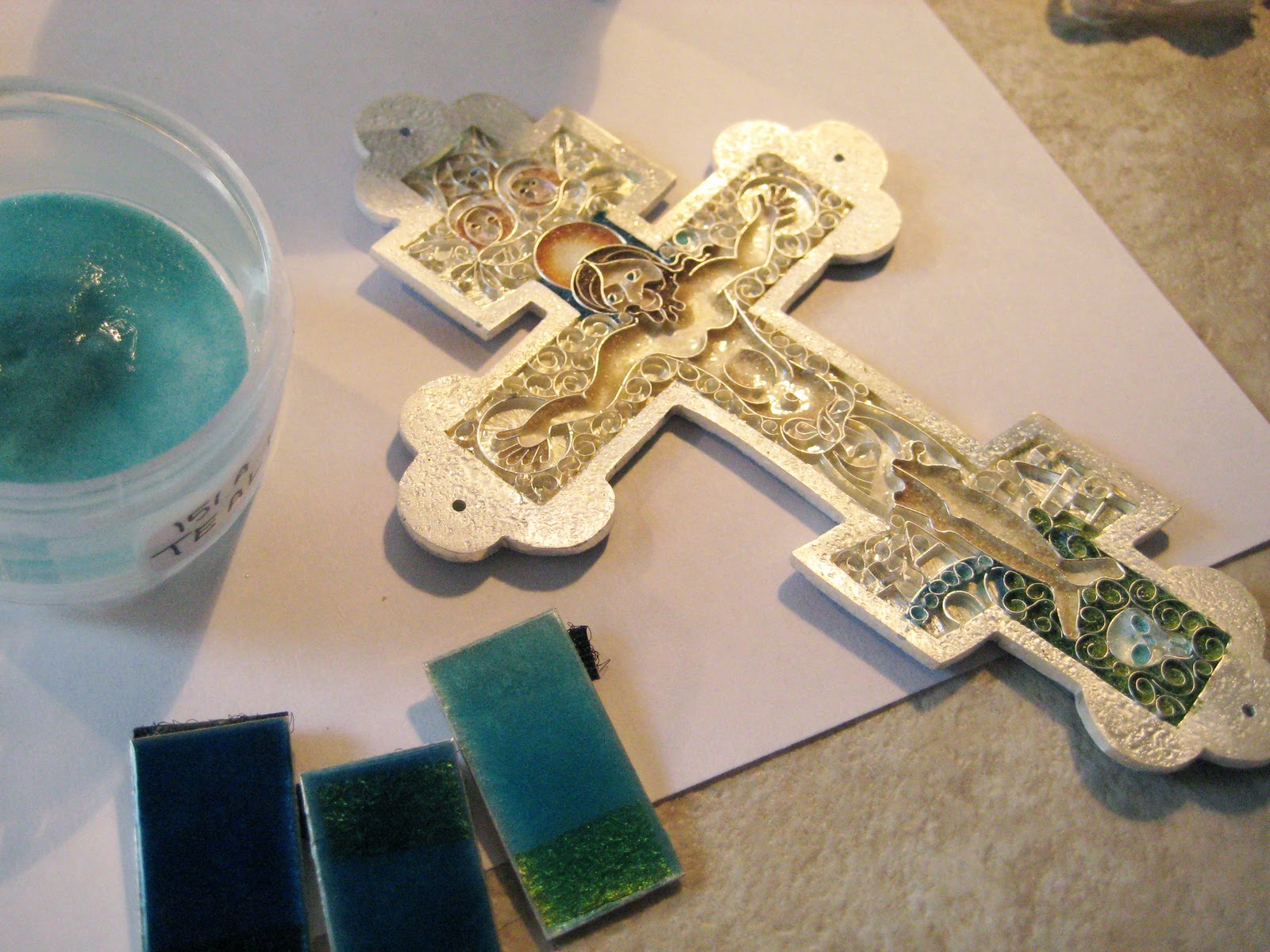
Step 5 - Attaching the Wires. This was a challenge, so I set the wires in place in stages. First, I adhered some gold leaf where the three halos were going to be. I had to eyeball it a little. Secondly, I laid in the wires of the main outline of the figure, then filled in with all the detail work. It took about 6 separate firings to get the wires in place.

Step 6 - Colors! The best part, finally.


I was on a bit of a roll, so I made a little cross for my sister Karen, who is a United Church of Christ Minister...


 |
| The Front of Jovan's Cross |
 |
| The reverse side |
Step 1 - Research and sketching. I spent a lot of time looking at images of historic Russian crosses. I decided early on that I would do a pictorial version with no lettering, except for Jovan's name on the reverse. Here's my final sketch:

Step 2 - Bending all the little wires. This was a challenge. I started with the thicker wires outlining the figure of Christ, and filled in from there...

Step 3 - Fabricating the Back. On the front side, I focused on a classical figure, but on the reverse, I went a little crazy and free form. It's a cut-out design in 22 gauge sterling, on the top is the holy spirit, which I interpreted as a phoenix swooping down. Jovan told me that sheaves of wheat are very important as symbols of bounty and goodness. The fish at the bottom are personal as well, since beyond the obvious interpretation, Jovan has a delightful coy pond in his back yard.
I particularly like the image with all the holes drilled in the metal. There's no going back at that point! For each tiny hole, I had to thread my saw blade through the opening, make a tiny cut, then repeat the process for every single hole you see. I remember sawing for a very long time.

Step 4 - Fusing the Base. This was a serious pain in the butt. It's a large piece of silver, and I probably used a whole tank of gas trying to fuse the top and bottom together. As a side note, I would fabricate it out of sterling next time, but that's a whole different story.
 |
| Don't try this at home... |

Step 6 - Colors! The best part, finally.


Saturday, July 10, 2010
Fun with Rejects

Every jeweler has a box of castoffs- so many things can and do go wrong in enameling, that I'm actually surprised my box isn't bigger. Sometimes the color was bad or cloudy, or I over-ground it, or it just didn't work out. I've decided to give them a nice, long soak in acid to remove the enamel. I use Etch-all, which will only dissolve the glass and leave the silver untouched. I can also reclaim the 24k gold wire from two of the rings I made, which makes it all worth while. The silver settings can be reused, or I can send them in as scrap.

The Etch-all, being that it's meant to just do a light etching in glass, takes a really long time to actually remove all the layers of enamel. But it's not a bother, because it's super easy. I put these in a couple of days ago, and once or twice a day, I'll give the pot a stir. We are about halfway there...
Thursday, June 24, 2010
Little Helpers

It's so hot out today, that I'm offering up a cute cat picture to cool things down. Don't worry, I decontaminated my workspace before I let the kitties in. They like to be where the action is!
Sunday, June 20, 2010
Making Sample Strips!

Enamels can be a tricky business. As all enamellists know (or find out to their peril), the enamel color that you see in the catalogue or website is usually nothing close to the color you end up with in the studio. That’s why it’s important to make your own sample strips.
Ages ago, I purchased a large quantity of old enamels from an enamellist who was moving on to other things. They have sat, largely untouched, in a corner of my studio for several months. I would paw through the box occasionally and read the names of the colors: “Blue Jay”, “Bishop Violet”, “Mikado”, “Regal Purple”, “Alice Blue”. Would they live up to my imagination? No way to know until I had the time to unpack them and test them for myself. Luckily, now that the Vegas show is done, I have a little time on my hands! So exciting!
 I never skimp on sample strips. I know that fine silver is expensive, but it’s a bigger waste of time and money if you don’t have a real sense of each color you are using. I get a lot of pleasure just arranging the different colors and imagining the possibilities. So, to that end, I make all of my samples ½” x 1” fine silver. (22 gauge). That gives me enough space to see three things:
- How does the color look when it’s actually touching the silver?
- How does it look on top of a nice coating of clear enamel?
- How does it look on top of 24 carat gold leaf?
 They still need a coat of counter enamel on the reverse side. I always use some junky unleaded leftover enamel. In this instance it’s Thompson Quill White. A color that has never in my experience actually turned out white. It’s usually an icky shade of yellow. But I bought too much of it long ago, so now it’s my “go to” reverse color for sample strips. I never sift leaded enamels if I don’t have to, so this works out just fine...
After enameling the reverse, I put a coat of clear on the front, but then wipe about a third of it. I want to see how the enamel reacts to silver. (Ugh. The bane of the silver enamellist’s existence!) A lot of colors react poorly with silver, especially reds and oranges, and it’s good to know upfront what is going to happen. So that’s why I leave a bit of the silver exposed.
After I’ve fired a coat of clear enamel, I cut up pieces of 24 carat gold leaf and adhere it to the other end with a little Klyr Fire. Then I’m ready to make my samples!
 I usually do nine colors at a time, because that’s how many strips I can fit into my kiln. I do all different colors at once, and lay them out in a grid on my table to avoid confusion. If you do all blues, it’s easy to mix them up in the kiln and not know which blue is which after it’s all finished. And that would sort of defeat the purpose. So I alternate the colors, and label the sheets of paper.
It’s worth the extra effort. Here’s a good example of two yellows that sounded equally promising. (934 chrome chartreuse & 30 Soyer yellow). You can see that the one on the left reacted badly to the silver. Where it’s touching the silver, the enamel has turned dark brown. The other one, in contrast, looks pretty uniform both directly on silver, and over the coat of clear. I know which one is the winner…
 So it’s two days of well spent time- not all the colors are winners, but I’ve added enough to my color palette (especially some knock-out greens!) that I’m excited to incorporate them into my new work. So there you go. Sample strips.

Subscribe to:
Posts (Atom)

 Posts


